
Best Practices for Website Navigation Design: Enhancing User Experience and Engagement
Website navigation is crucial for guiding users through your website and helping them find the information they need. A well-designed navigation system not only enhances user experience but also improves engagement and increases conversions. Below is a list of important best practices for website navigation design that can elevate your website’s usability and drive success.
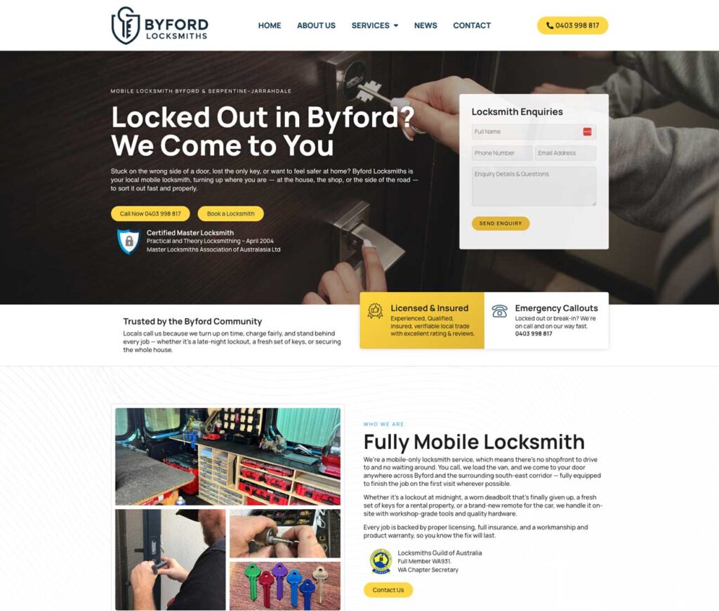
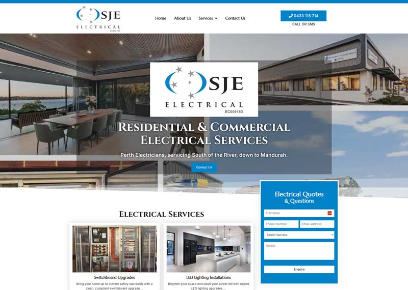
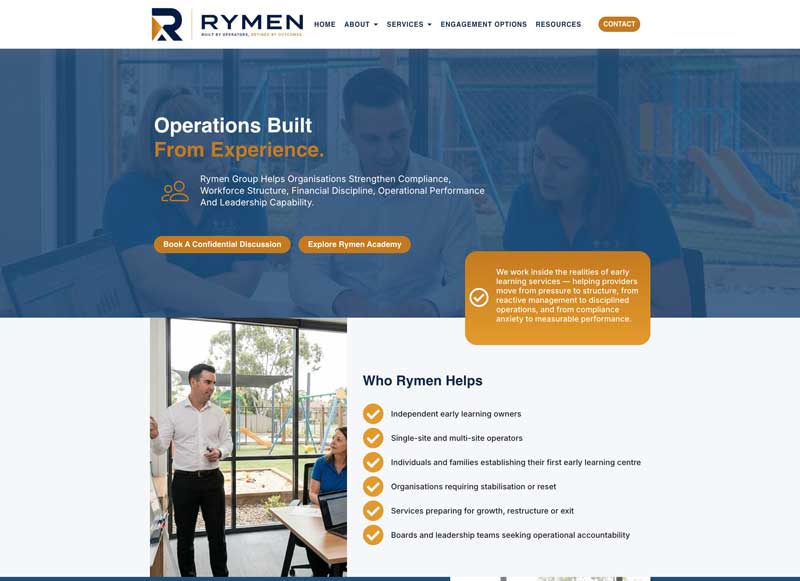
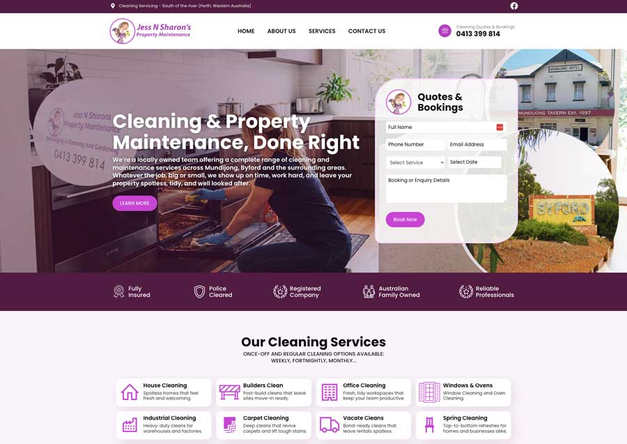
- Keep it Simple and Consistent:
Simplicity and consistency are key when it comes to website navigation design. Keep the navigation menu clean, uncluttered, and easily scannable. Limit the number of main navigation items to reduce cognitive load and prevent overwhelming users.
Consistency is equally important. Maintain a consistent navigation design across all pages of your website. This helps users establish a mental model of your website’s structure, making it easier for them to navigate and find what they’re looking for.
- Use Clear Labels:
Label your navigation items using clear and concise wording that accurately represents the content on each page. Avoid using clever or ambiguous labels that may confuse users. Use terms and language that your target audience understands to ensure clarity.
If necessary, include dropdown menus to provide additional subcategories and options. However, be mindful of overwhelming users with too many nested menus. Keep dropdown menus organized and intuitive, making it simple for users to locate their desired destination.
- Optimise for Mobile Devices:
With the increasing use of smartphones and tablets, optimizing website navigation for mobile devices is essential. Implement responsive design principles, ensuring your navigation adapts smoothly to different screen sizes.
Consider using a hamburger menu or other mobile-friendly navigation patterns to save screen space and provide a better user experience on smaller devices. Test your mobile navigation thoroughly to ensure it is intuitive and easy to use.
- Prioritize Important Pages:
Place your most important pages within the primary navigation menu. These are typically the pages that drive the most conversions or contain vital information. Keeping these pages easily accessible and visible ensures that users can find them without any hassle.
Secondary or less frequently visited pages can be placed in secondary menus or in the footer. This way, you maintain a clean and organized navigation structure while still providing access to additional content.
- Add Search Functionality:
In addition to primary navigation, consider implementing a search bar to provide users with an alternative way to find specific information. A search bar is incredibly useful for users who know exactly what they’re looking for or wish to bypass navigating through the menu.
Position the search bar prominently, usually in the header or in a fixed position, so that it remains accessible to users throughout their browsing experience. Ensure that the search functionality delivers accurate and relevant results to enhance its effectiveness.
- Visual Cues and Feedback:
Visual cues and feedback play a vital role in improving the user experience of website navigation. Implement visual indicators to show users their current location within the website hierarchy. Breadcrumb navigation, for example, displays the user’s path from the homepage to the current page.
Additionally, highlight the active or selected navigation item to provide immediate visual feedback to users. This helps them understand where they are within the website and reinforces their navigation choices.
- Test and Iterate:
After implementing your website navigation design, it’s crucial to continuously test and iterate based on user feedback. Utilize user testing and analytics to understand how users interact with your navigation and identify any pain points or areas of confusion.
I would also suggest that you gather feedback from users regarding their browsing experience and ask for suggestions for improvement. Pay attention to user behaviour through heat maps and scroll maps to gain insights into how users engage with the navigation elements. Use this data to make iterative enhancements to your navigation design.
As you can see, effective website navigation design plays a significant role in providing a positive user experience, improving engagement, and increasing conversions. By following the best practices outlined in this article, you can create a navigation system that is simple, intuitive, and consistent across devices. Prioritise the needs of your users, optimise for mobile, and continuously test and iterate for ongoing success. Remember, a well-designed navigation system is the key to unlocking the full potential of your website.